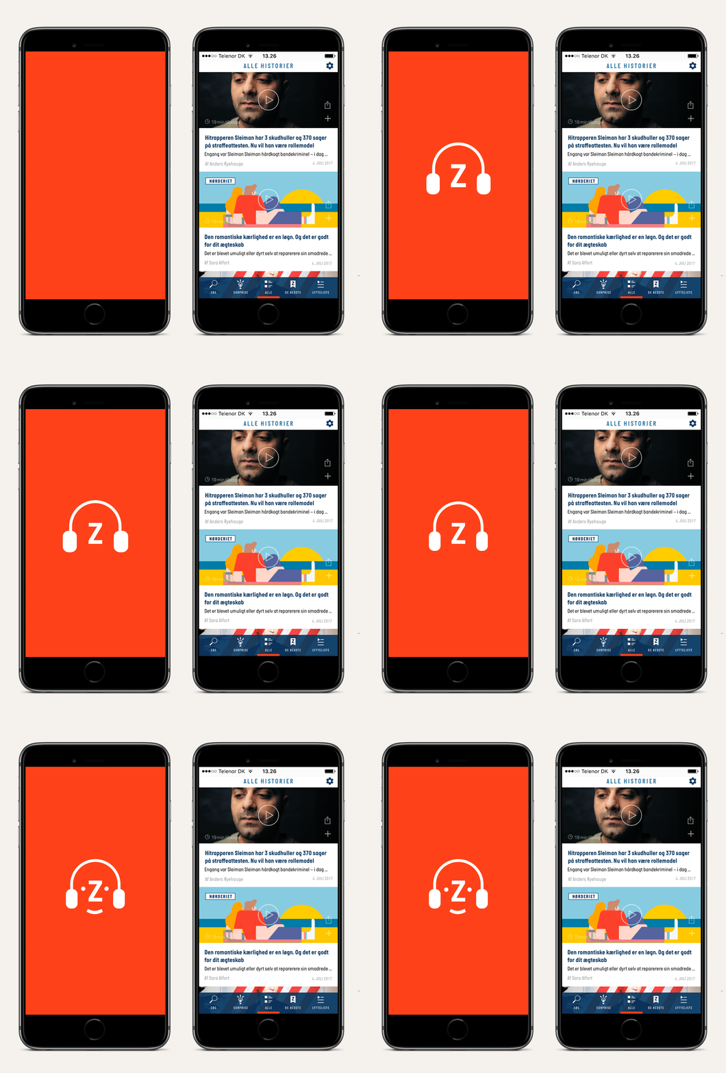
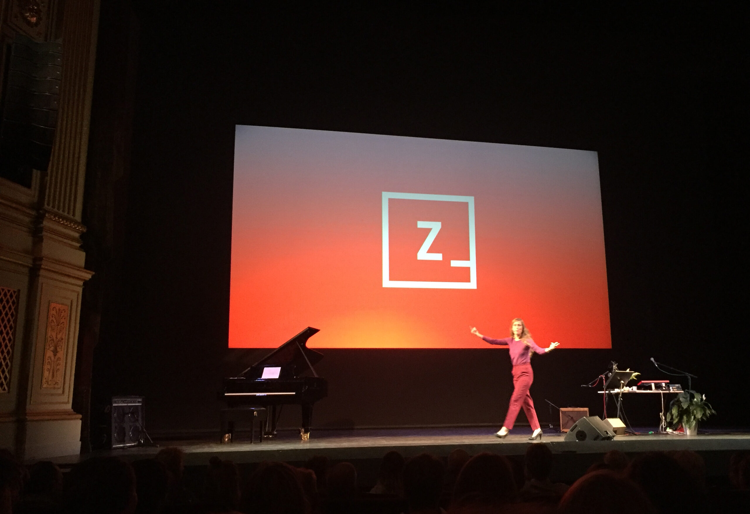
The playful hybrid
Zetland is a digital media that was launched in 2015. I served as the design director until 2018.
The mission was to rethink newdesign and create a dedicated community of subscribers from all demographics.
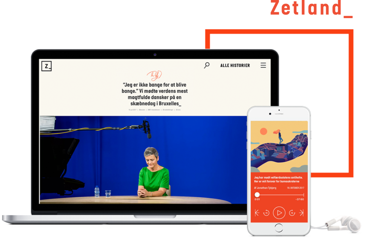
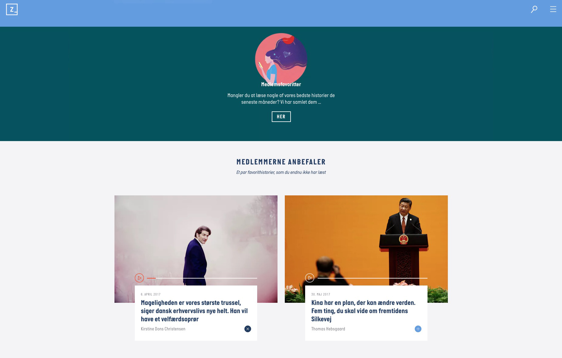
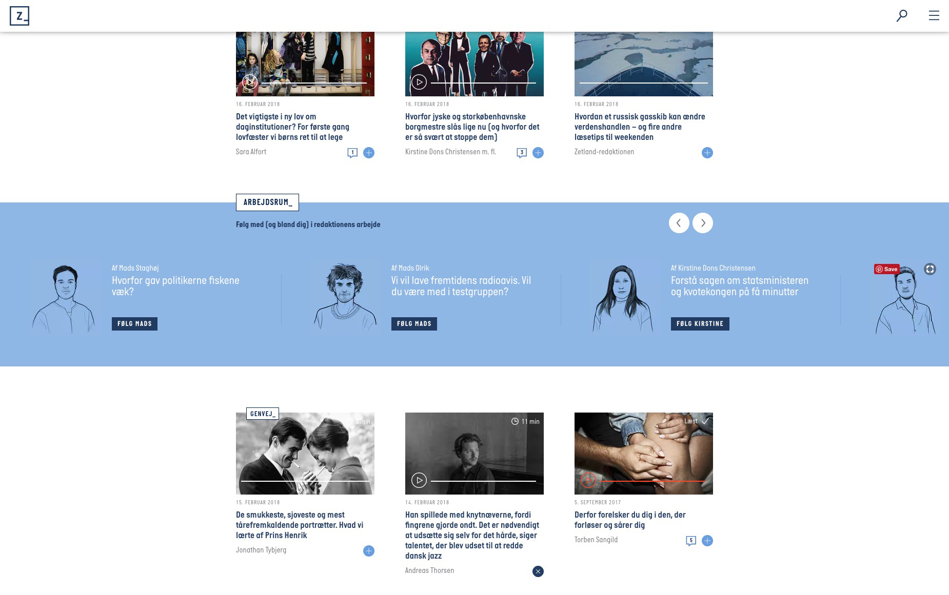
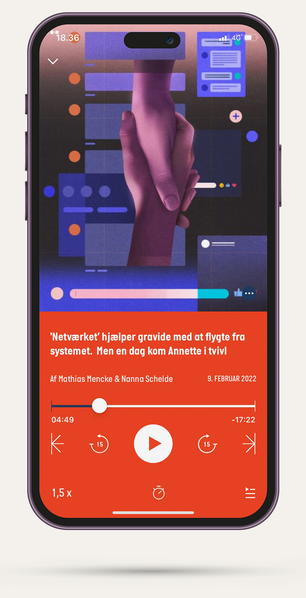
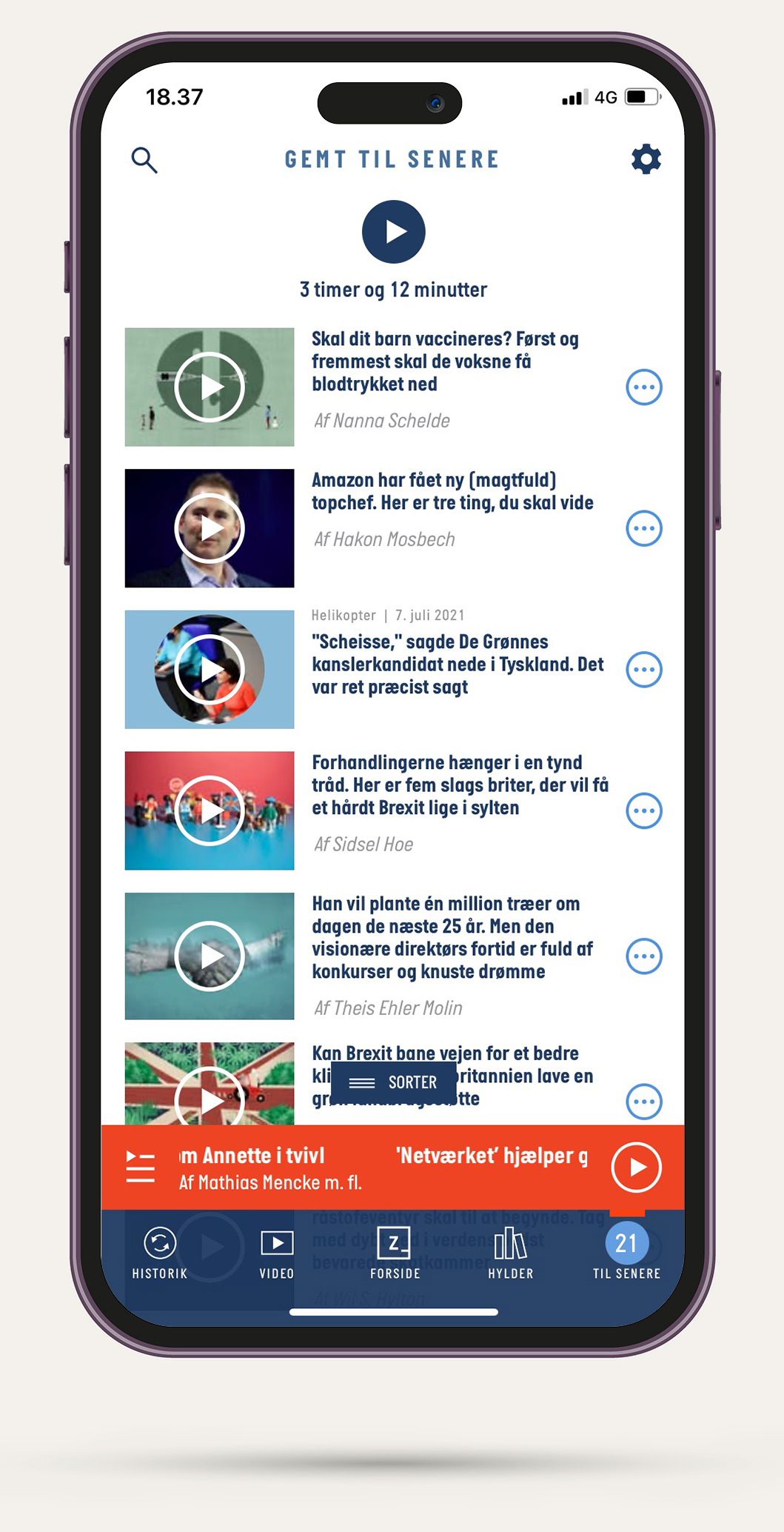
We succeeded in creating platforms with a fresh, different approach, avoiding the traditional news design. I designed the visual identity, website and app, based on the manifesto of being “flat, rectangular, and colorful” and added illustrations, animations, and photography from the most talented in their field. Zetland won Best of Show and Gold twice from Society for News Designers Scandinavia in the digital category, while I was in charge.

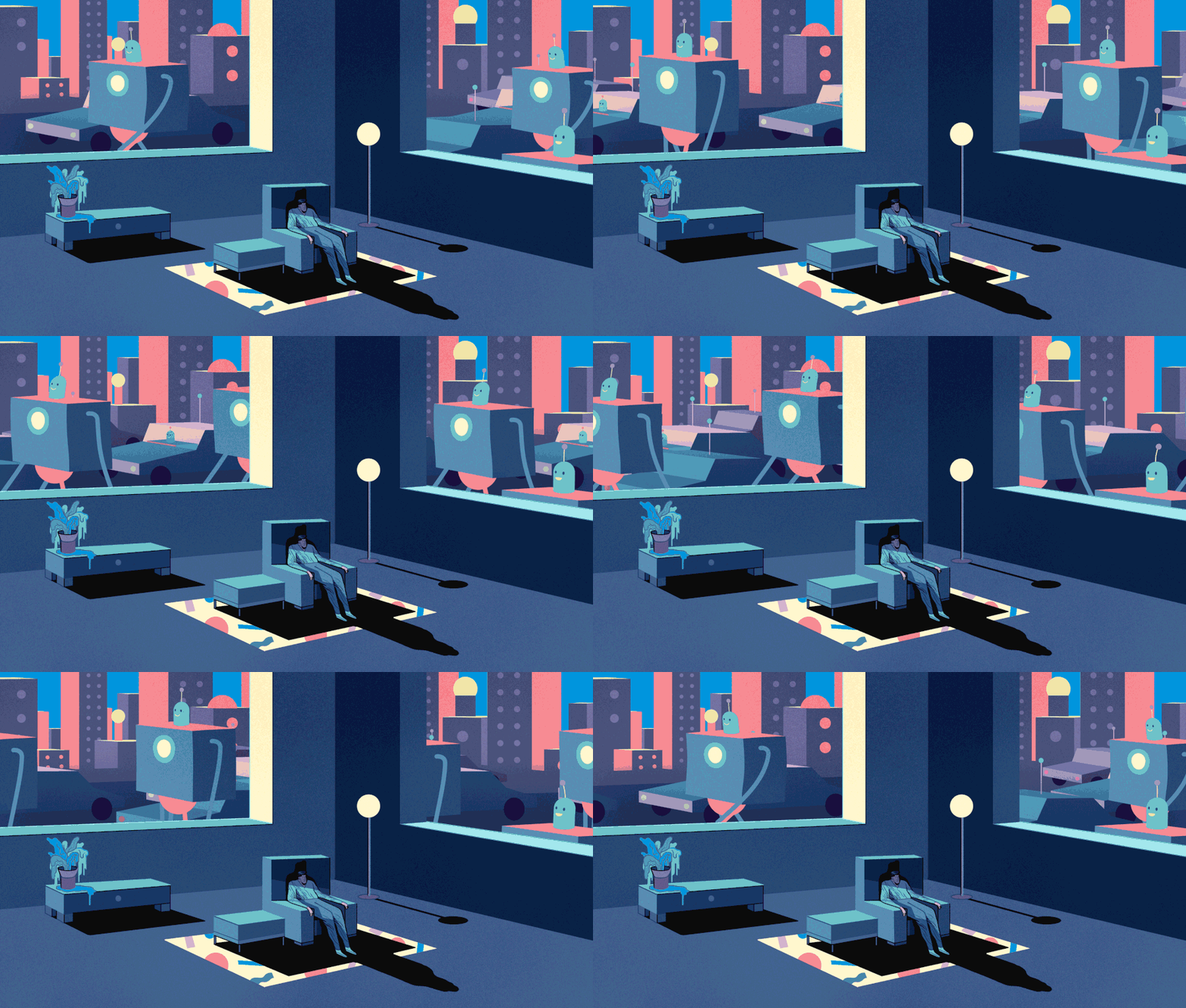

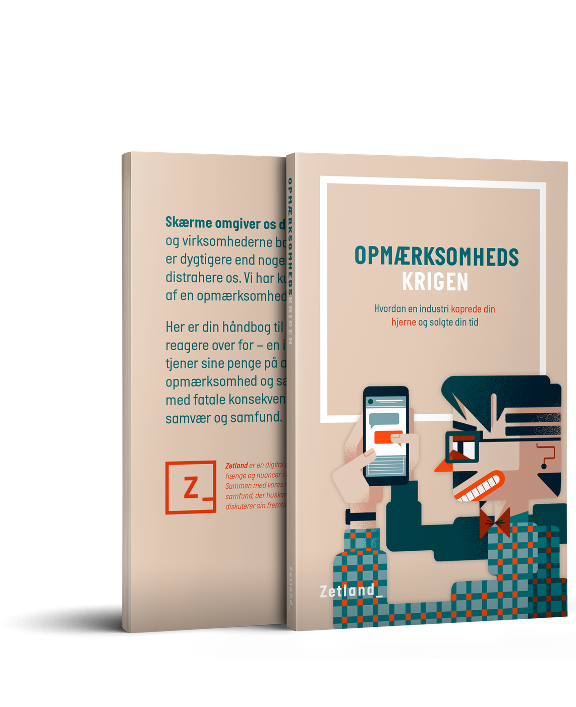
Zetland became a feeling, a movement, and over time, expanded into live shows and books. The brand has connected exceptionally well with a younger audience.
Stupid Studio have helped bring the visual identity to life by creating campaigns with the brand’s assets.
